Power, Privilege and the Purse
Project Description
This project was designed to help us learn about economics and the effect that it has on different groups of people in the United States. This project was divided into two major sections.
The first focused on microeconomics or personal finance. We learned how to can organize our money so that we can have enough money for our short term (6 months to 2 years), mid term (10 to 20 years) and long term goals (20 years or more). We learned about different ways of investing and saving money such as the stock market, bonds, certificate of deposits, savings accounts and their associated risks. We then learned how to calculate simple interest, compound interest and annuities.
The second part of the project focused to macroeconomics, or the economics of the united States as a whole. We focused on the banking practices set up for the rich and the banking practices set up for the poor. We studied the socioeconomic effects of income inequality, it's causes and its implications for different groups. We also focused on statistics concepts such as shape, center, spread, standard deviation, z-score and correlation coefficient and how to make different kinds of graphs from the data that we had collected or found. We studied how to best visually represent different kinds of data that we had collected or found.
Process
Journal your progress throughout the project. What did you do? How did you create your financial plan, infographics and other products? How and when did you use the math? What challenges did you face and how did you resolve any issues you ran into? What parts of the project did you enjoy?
Math was a vital component of this project. Understanding the math and economic concepts in place was vital to understand the social and political problems that different groups of Americans face.
Before this project, I did not know much about economics or statistics. I had never studied economics in any way in the past and the world of saving and investing was foreign to me. I did not know how compound interest worked, how to calculate an annuity or how to calculate the future value of an investment. After the working on this project, I understand what these formulas are and am confident in using them.
As I studied different economics concepts in this project, I created a personal financial plan which showcased all of my work. This plan contained the cost of my desired college and how i would pay for it, the taxes that I would have to pay based on my estimated income after college, a short term, mid term and long term investment with the monthly payments I would have to make in order to achieve them and a monthly personal budget (based of of my estimated income).
To choose my college and major I looked at the field I was interested in, engineering, as well as the specific jobs that pay the highest straight out of college. I then looked at my top 3 colleges; their cost, return on investment, graduation rate and time to graduate. I then chose my top college and major and calculated how I would pay for it. I looked at the financial aid that I would receive and the amount that I would have to make up in government and private loans. After that, i calculated how much I would have to pay each month in order to pay off the loans.
I then calculated the taxes for my annual income after college. I included the Fica, federal and state taxes. I then created a short term, mid term and long term goal and calculated how much money I would have to save each month to have enough money to pay for my goals when the time comes. After calculating my financial goals, I incorporated those monthly payments, as well as my college debt payments into my monthly budget. I placed the rest of the money towards different products and activities. With my net mostly income being $4,017.63 and my savings and debts taking up $2059.15, I spent most of my money on food, housing, public transit and healthcare. The economics portion of this project helped me to set hypothetical, yet realistic, financial goals for myself. This project has equipped me with the tools that I will need to calculate the cost of the choices I make.
Below is My Financial Plan and Monthly Budget:
I went through a similar learning curve during the statistics section of this project. It took a lot of effort to understand new concepts such as Standard Deviation, Z-Scores, 5 number summaries. One of the most difficult things for me to learn was Standard Deviation. Both the concept and formula were confusing at first. I eventually was able to grasp that the Standard Deviation of a data set was simply a measure of how spread out the data is. This is important because 2 completely different data sets can have a very similar mean and median. The Standard Deviation is a measurement that allows us to understand what the data looks like more than simply looking at the center. The formula was confusing because it had so many steps and the symbols that represented those different steps were new to me. Eventually I got it and now I more confident calculating it.
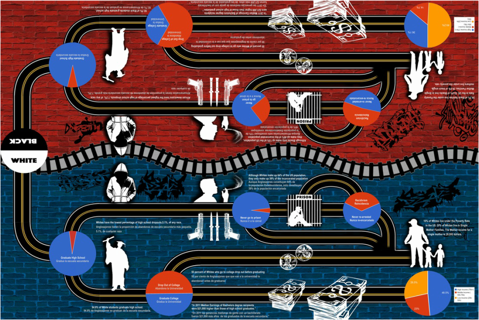
Although the content was challenging, I enjoyed learning about how to numerically and visually represent different kinds of data. It took even more effort to take the concepts that I had learned and apply them to my work. I believe that my performance exceeded expectations because I was able to bring the data to life. I was able to use all that I had learned to make an interactive board game that guests played during the night of exhibition as well as an infographic that clearly displayed unbiased data. I was able to articulate the concepts that I had learned to the guests and explain the data that was being visually represented.
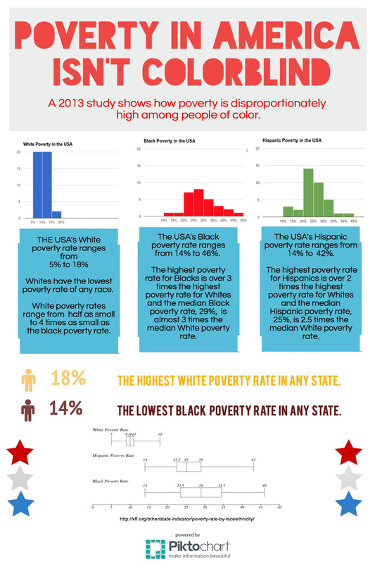
I created an infographic that displayed the different poverty rates for Whites, Blacks and Latinos.
Here is my Infographic and Board Game Design:
Although the content was challenging, I enjoyed learning about how to numerically and visually represent different kinds of data. It took even more effort to take the concepts that I had learned and apply them to my work. I believe that my performance exceeded expectations because I was able to bring the data to life. I was able to use all that I had learned to make an interactive board game that guests played during the night of exhibition as well as an infographic that clearly displayed unbiased data. I was able to articulate the concepts that I had learned to the guests and explain the data that was being visually represented.
I created an infographic that displayed the different poverty rates for Whites, Blacks and Latinos.
Here is my Infographic and Board Game Design:
Symposium Pictures
Deeper Learning
- What did you learn about financial concepts such as budgeting, taxes, investments, savings and debt? How did you use mathematical modeling to help make financial decisions?
In creating my Financial Plan. I used compound interest formulas to calculate how much money I would have after a given period of time. I also used annuities to calculate how much money I would have to pay each month to have enough money to fulfill my financial goal on time.
- What did you learn about exponential growth and decay, such as compounding interest?
- Discuss the Statistical Problem Solving Process and explain how you used it in this project.
1. Ask a question: In the first step simply formulate a statistical question that can be answered with data. It is important to choose a question that can be answered using quantitative data if you want to display it as a graph.
2. Collect Data: In this step, create a plan to collect data that is related to your question. Data can be collected through observations, questionnaires, experimentation or through looking at existing databases.
3. Analyze the Data: In this step, organize and summarize the data by creating graphs and/or calculations of shape, center and spread using 5 number summaries, standard deviation, z scores and correlation coefficients. Graphs for data include: histograms, dot plots, and box plots.
4. Interpret the Results: Interpret your finding from the analysis of the data to answer your question. The most useful way to do this is through an infographic, where you will give an interpretation of how the data answers your questions as well as well as a visual representation of the data.
I used this process to create my infographic as well as my board game. The main question for my infographic was: Are the poverty rates for different races different? If so, how different? I collected data using a data set collected by the Kaiser Family Foundation, a organization known for providing accurate data. I then used that data to create histograms for the Black, Latino/Hispanic and White poverty rates in the United States. I also created a 5 number summary and a corresponding box plot. In my infographic I also explained the data that I had visually represented. My original question was answered by my infographic. I now know that the poverty rates for Latinos and Blacks are much higher than the poverty rates for whites and have a much larger spread.
- How did you use what you learned to better understand the societal issues that were discussed in the project?
Mind the Gap Exhibition
This project taught me that data can be used and manipulated to support certain view points. As I tried to visually display large data sets from the government and other organizations, I learned how different ways of displaying the same data can send different messages to the viewer. For example, I had a data set from the Kaiser Family Foundation that displayed the 2013 US poverty rates by race in each state. I decided to display the different poverty rates as a histogram on Google sheets. Google sheets generated histograms automatically but as I experimented with the advanced edit, I realized that I had a lot of power over how the data looked and, in turn, the message it conveyed. For example, by increasing or decreasing the bucket size of each histogram, I could make the poverty rate of different rates seem small or huge. A bigger bucket size made the poverty rates look higher for some races because it grouped more poverty rates into one bar. Similarly, decreasing the bucket size made more bars, but each bar was lower because less percentages fit into the same bar. I noticed that when my classmates saw a few really tall bars, they thought that the poverty rate was higher and that when there were many short bars they thought that the poverty rate was lower. I had showed them the same exact data, but by showing it in different ways I sent different messages.
I also learned that statistics is a powerful tool but it takes hard work and creativity to make it accessible to an everyday person who may not have a in depth understanding of statistics or the issue being discussed. This realization helped me to come up with the idea of a game board. Originally, I was going to make a poster that the audience could not really interact with but then I realized that it would be easier for them to see the discrepancies between the Black and White experience if I turned the pie charts into spinners and made my poster an interactive board game. I was right, people of all ages were more interested in my board game than our groups posters and were able to connect more to the issues we were talking about.
I really enjoyed learning about statistics and how to use them. Know that I have a basic understanding of statistics concepts like Standard Deviation, Z-scores, Shape, Spread and Center, I feel confident in making useful graphs of different kinds of data. I now know when to use a box plot vs a scatter plot vs a histogram. Learning how to make accurate visual representations of data has helped me to make more persuasive arguments. Instead of looking for a graph that someone has made to support their argument, I can collect my own data and make my own graph to support my argument.
